At Studio Elluvio, we see the same pattern repeat across industries: design teams chase aesthetic perfection while ignoring the fundamentals of conversion, clarity, and human behavior. The result is a stunning digital presence that silently leaks revenue.
Visual polish often hides weak performance. Here is a breakdown of why aesthetically pleasing websites fail to convert, and what the best-performing brands do differently to turn design into measurable growth.
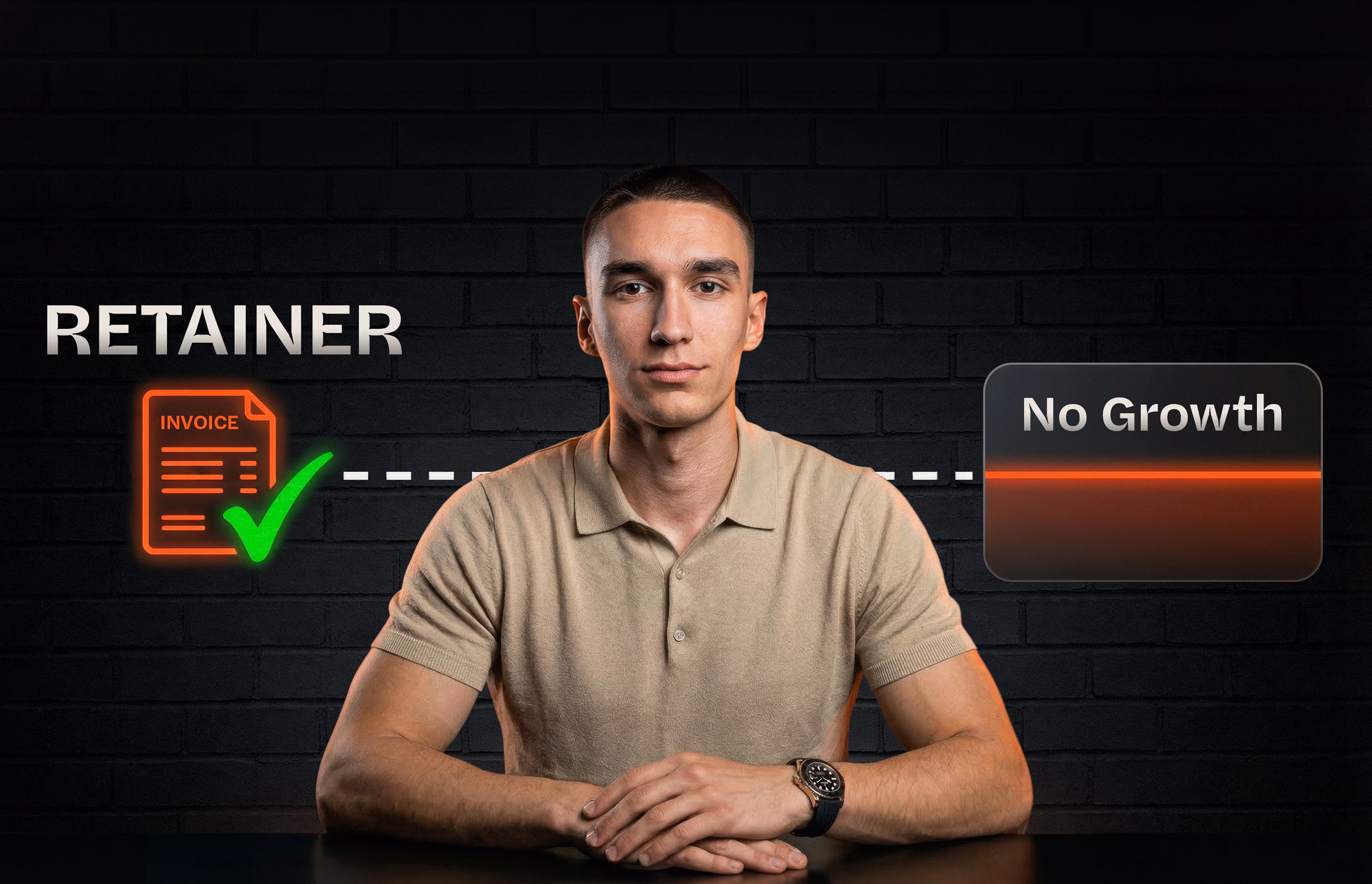
The Aesthetic Trap: Why Awards Don't Equal Revenue
In the pursuit of standing out, brands often overcomplicate their digital experiences. They prioritize complex animations, unconventional navigation, and vague, "clever" copywriting over user clarity.
When a user lands on your site, they aren't looking to be entertained by your code; they are looking for a solution to a problem. If your website prioritizes the designer's portfolio over the user's journey, you create friction. And in the digital ecosystem, friction kills momentum.
A website should never be just a visual asset. It must be a performance engine.
3 Reasons Your Stunning Website Isn't Converting
To move users from passive intrigue to active intent, you have to diagnose where the user journey breaks down. Here are the three most common failure points of "beautiful" websites:
1. You Built for Intrigue, Not Intent
Aesthetics create intrigue, but architecture creates intent. If your website lacks a clear, logical sales funnel, users will simply admire your typography and bounce. Every layout, heading, and call-to-action must be deliberately placed to guide the user toward a specific decision. Without a persuasive hierarchy, visitors are left to wander aimlessly.
2. Form Has Overpowered Function (UX Friction)
We frequently see brands sacrifice usability for the sake of a "minimalist" aesthetic. Hidden menus, low-contrast text, and scroll-hijacking might look sleek, but they frustrate users. When trust needs to become transactional, clarity is your most valuable asset. If a user has to think about how to navigate your site, you have already lost them.
3. Ignoring the Commercial Logic
Traditional agencies deliver visual assets; they do not deliver business outcomes. A beautiful website fails when it is built without a foundation of data and psychology. Design must be held accountable to results. If your site wasn't built around customer acquisition, cart optimization, or lead generation frameworks, it is simply a brochure.
The Solution: Design That Converts
Turning visual authority into exponential growth requires a shift in mindset. You must fuse creative craft with commercial logic.
At Studio Elluvio, we don't just make things look better; we engineer them to perform better. To fix a failing website, you must apply a disciplined framework:
- Diagnose the Friction: Audit your current data and map where users are dropping off. Look beyond the visuals and analyze the conversion paths.
- Prototype for Action: Restructure your architecture. Build funnels that align with human psychology, ensuring every interaction reduces friction and heightens desire.
- Craft with Purpose: Apply the visual polish only after the structural logic is bulletproof. The UI should elevate the brand credibility without getting in the way of the conversion.
- Prove and Scale: Design is never truly "finished." It must be tested, analyzed, and optimized based on real user behavior to compound your impact and accelerate revenue.
Stop Chasing Polish. Start Engineering Momentum.
If your website is visually stunning but commercially stagnant, it's time to stop treating it like an art project and start treating it like a measurable investment.
Design is only successful when it drives a specific outcome. From the layout to the analytics, every element should work to move users from discovery to decision, turning clicks into lasting loyalty.