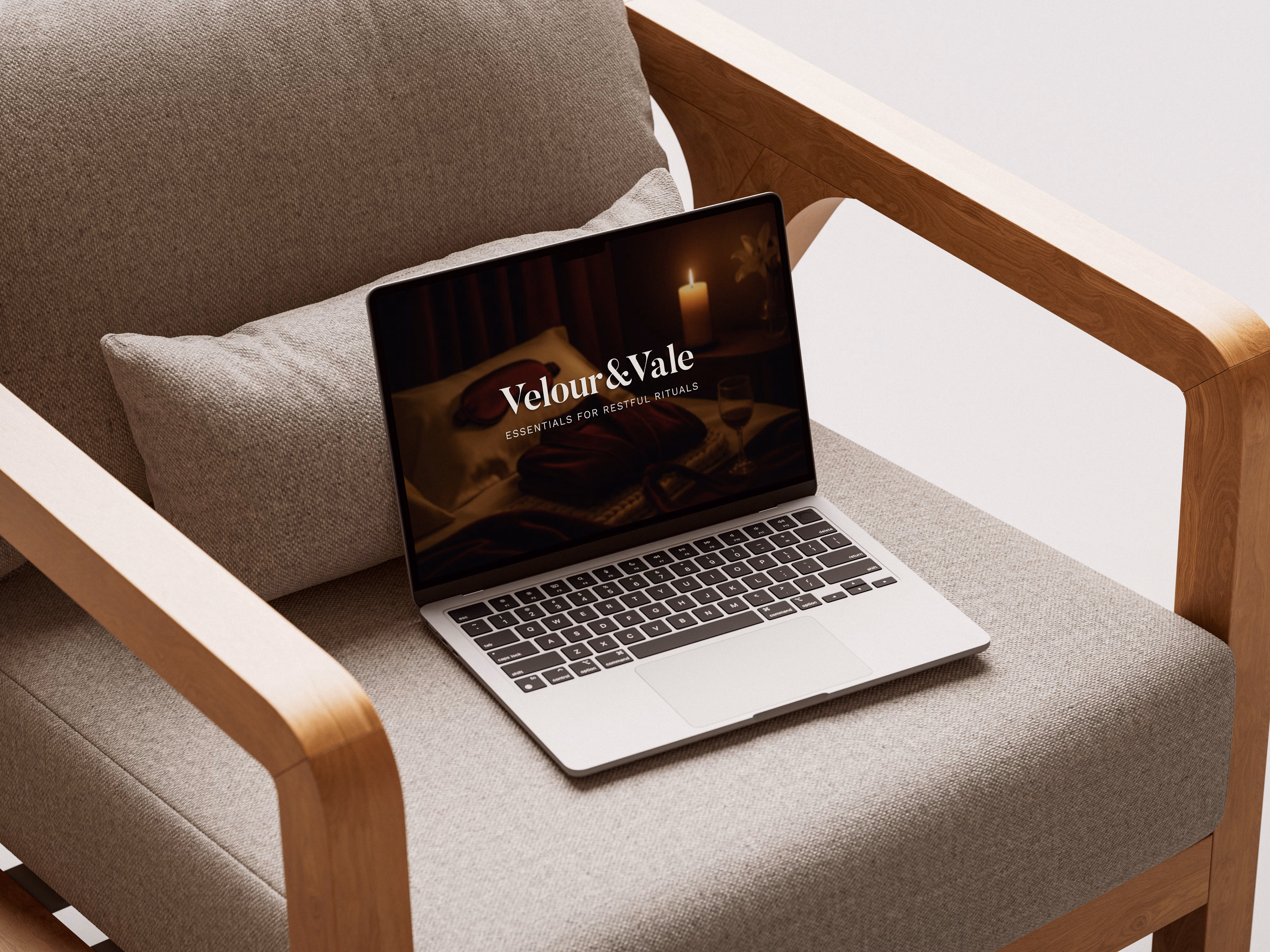
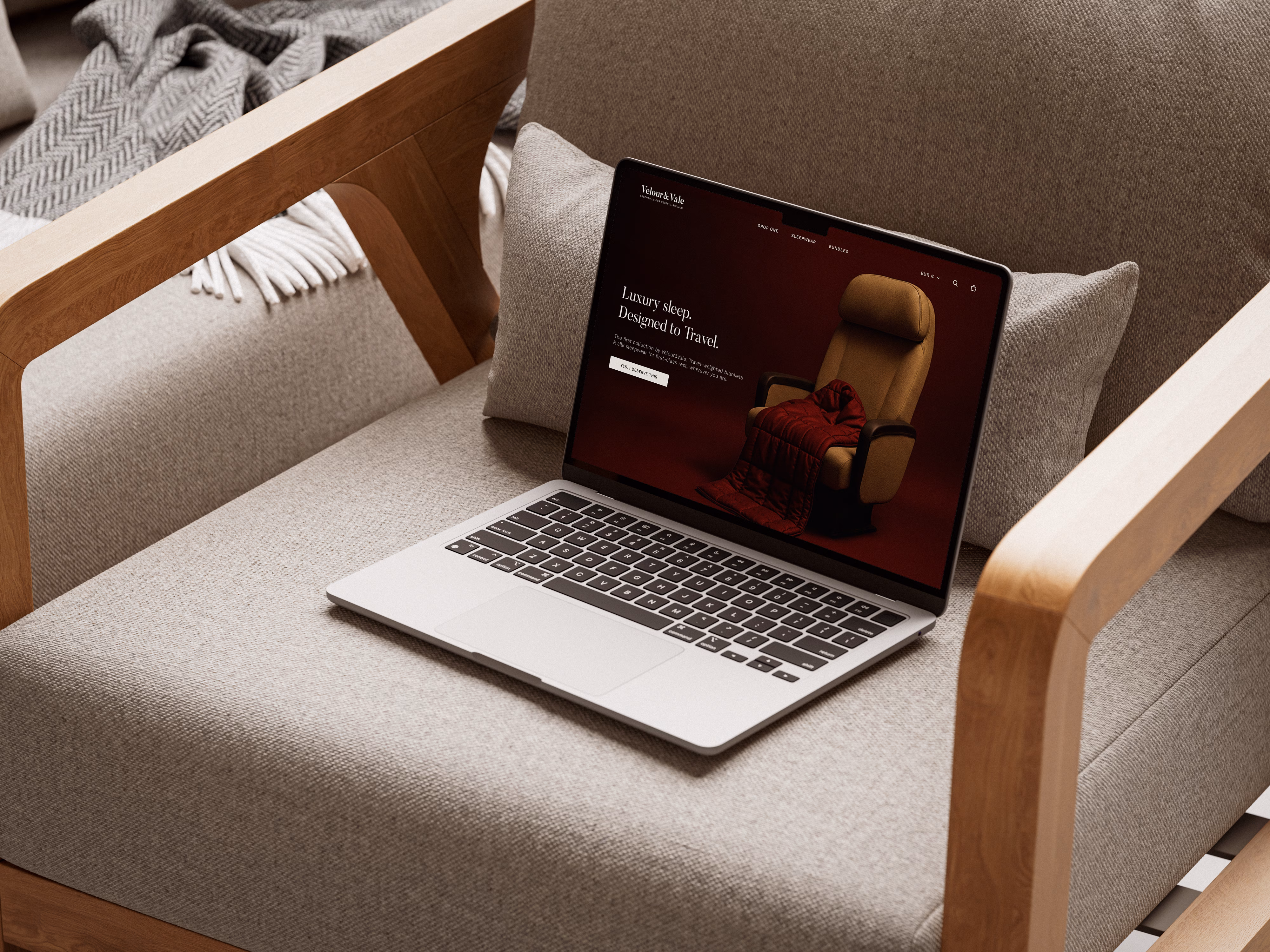
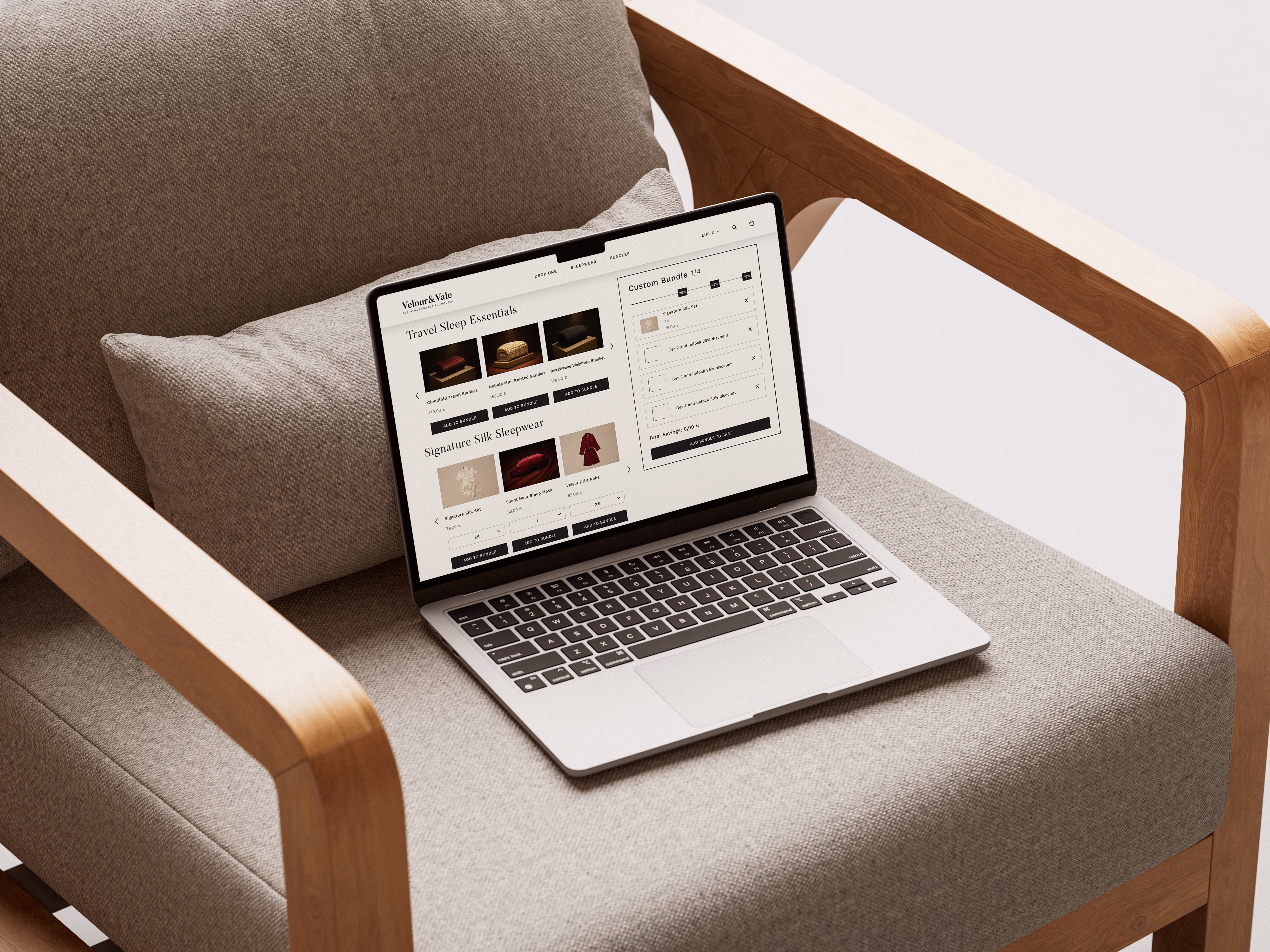
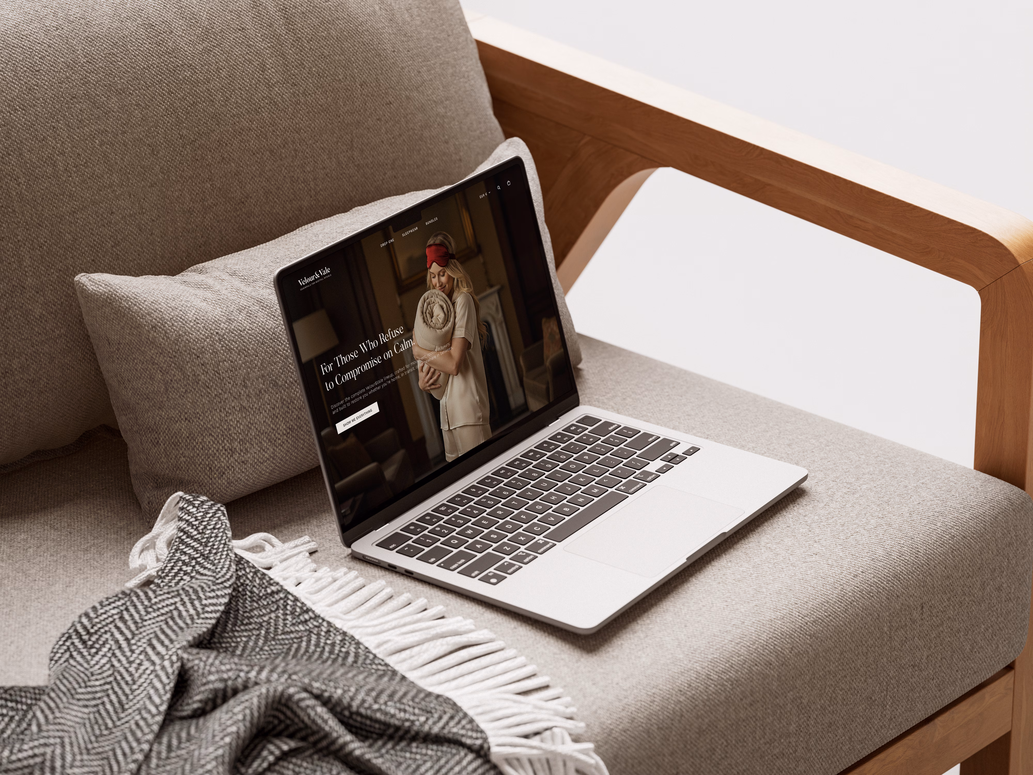
Velour&Vale Essentials for Restful Rituals Brand Identity
Velour&Vale entered a market where every sleep-wellness competitor uses the same muted palette, the same soft typography, and the same language of rest. Looking premium was not the challenge. Looking distinct enough to justify a premium price, that was. The identity was built around a single strategic decision: treat rest not as a category, but as a practiced ritual. That distinction shaped everything: the tactile spacing, the unhurried layouts, the typography that holds both modern clarity and old-world warmth. Not decoration. A system designed to make the brand feel inevitable to a buyer who has seen every other option. The result is a brand that doesn't need to compete on price because it no longer appears to belong in the same conversation as its competitors.